
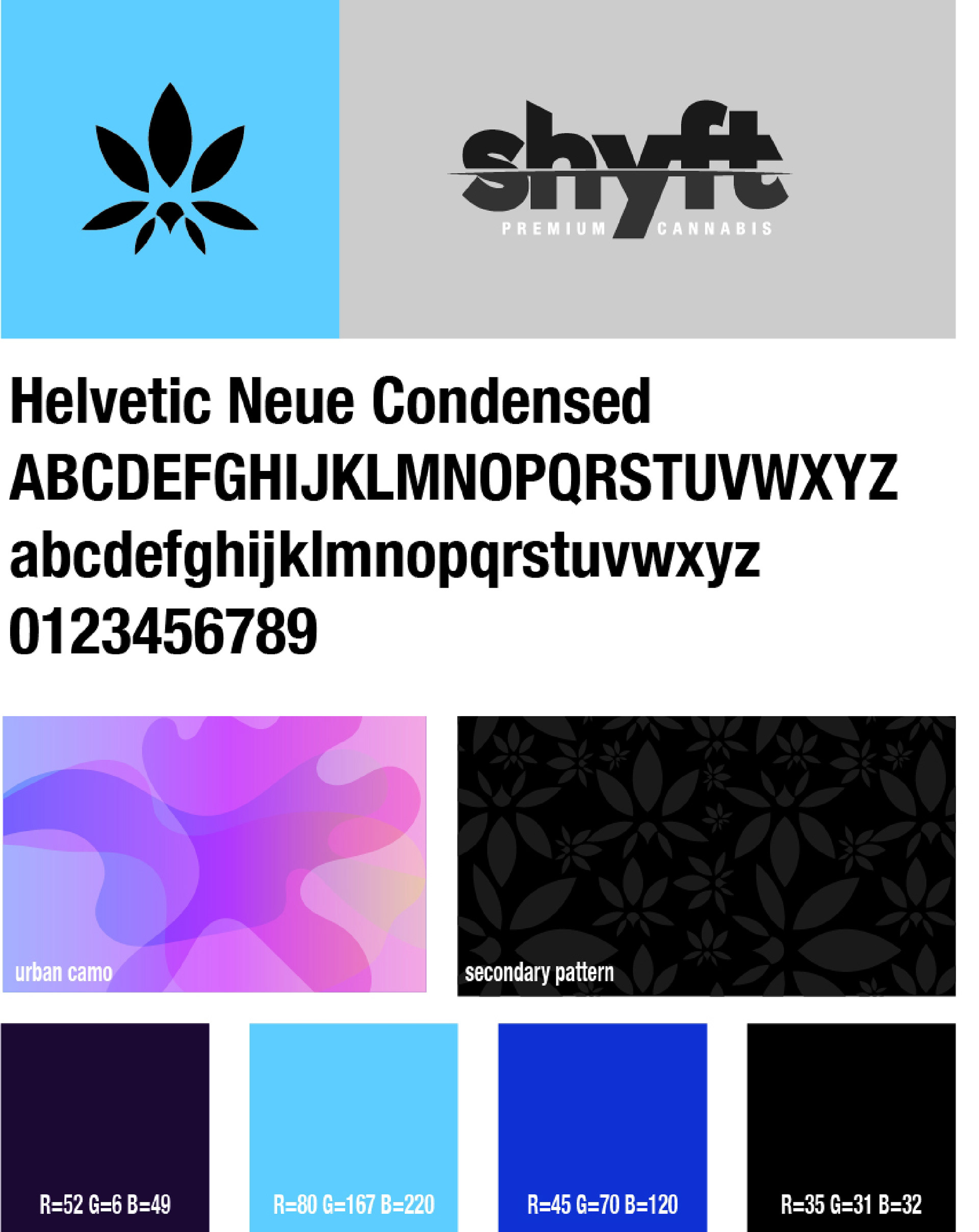
Challenge
A leading medical cannabis company in the Midwest was looking to create a brand that would be consumer-facing now that cannabis was legalized in Midwest states. They wanted a brand image targeting 20-35-year-olds skewed more masculine and had a gritty, urban edge. In addition, this would be a premium offering at a higher price point. Product forms at launch include flowers, pre-roll joints, concentrates, and edibles.
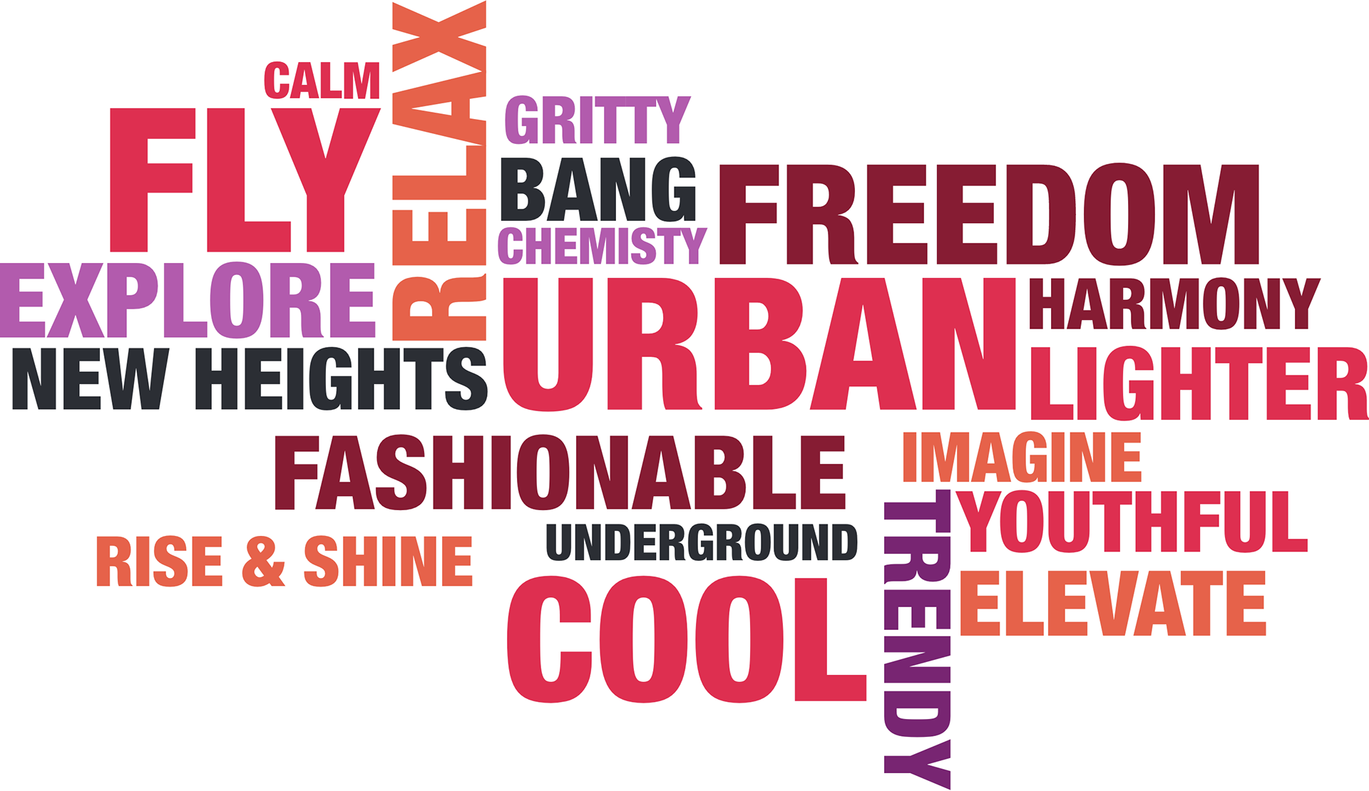
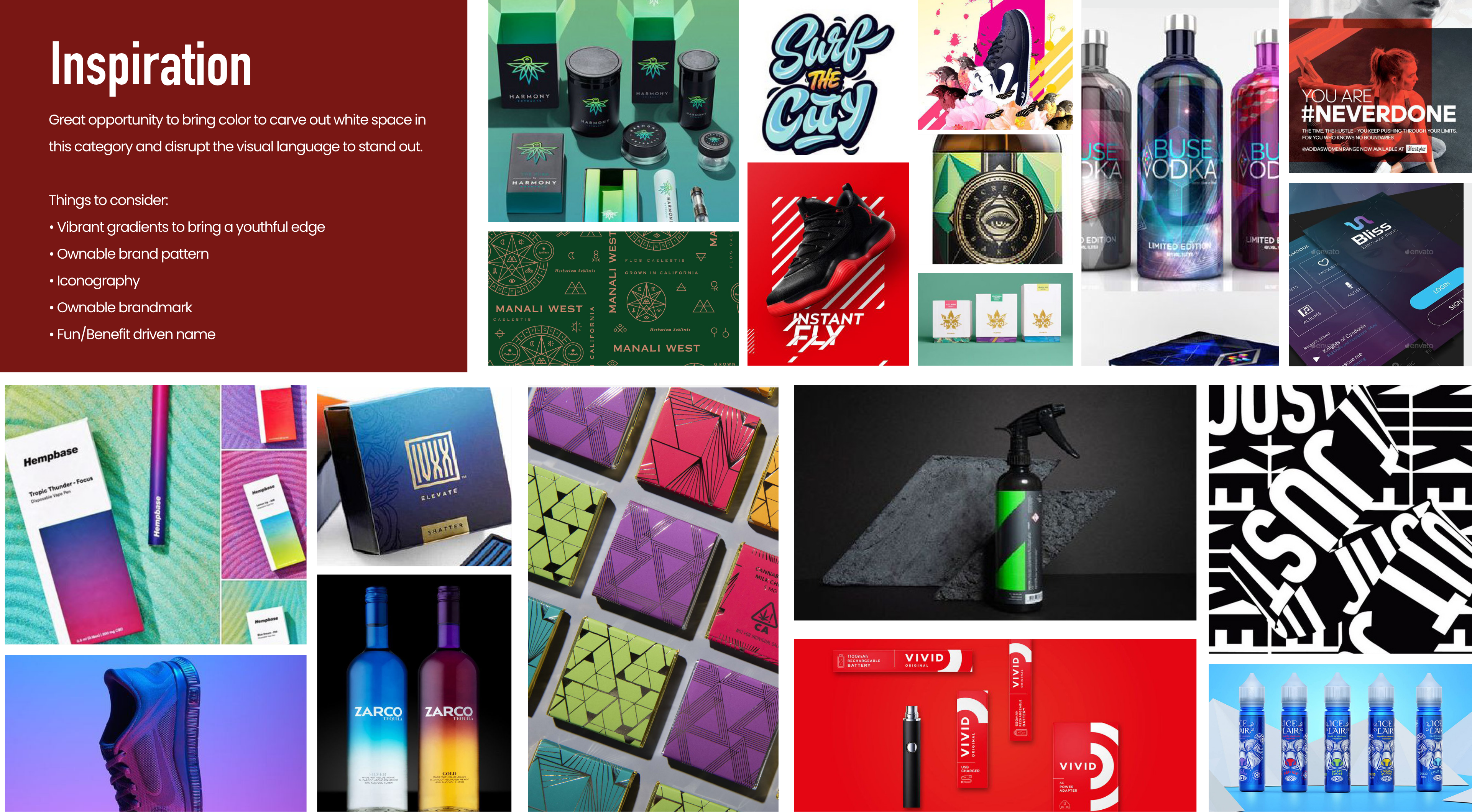
Concept Inspiration
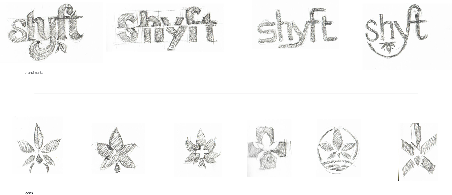
Naming and logo mark iteration
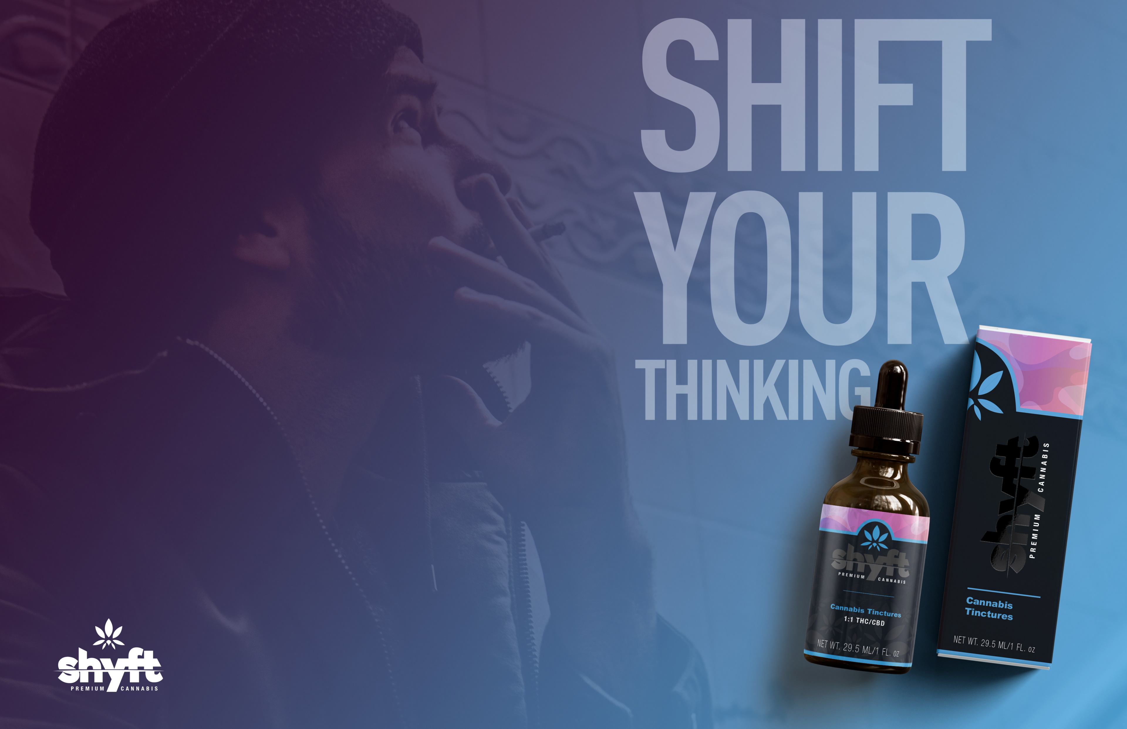
Graphic Application
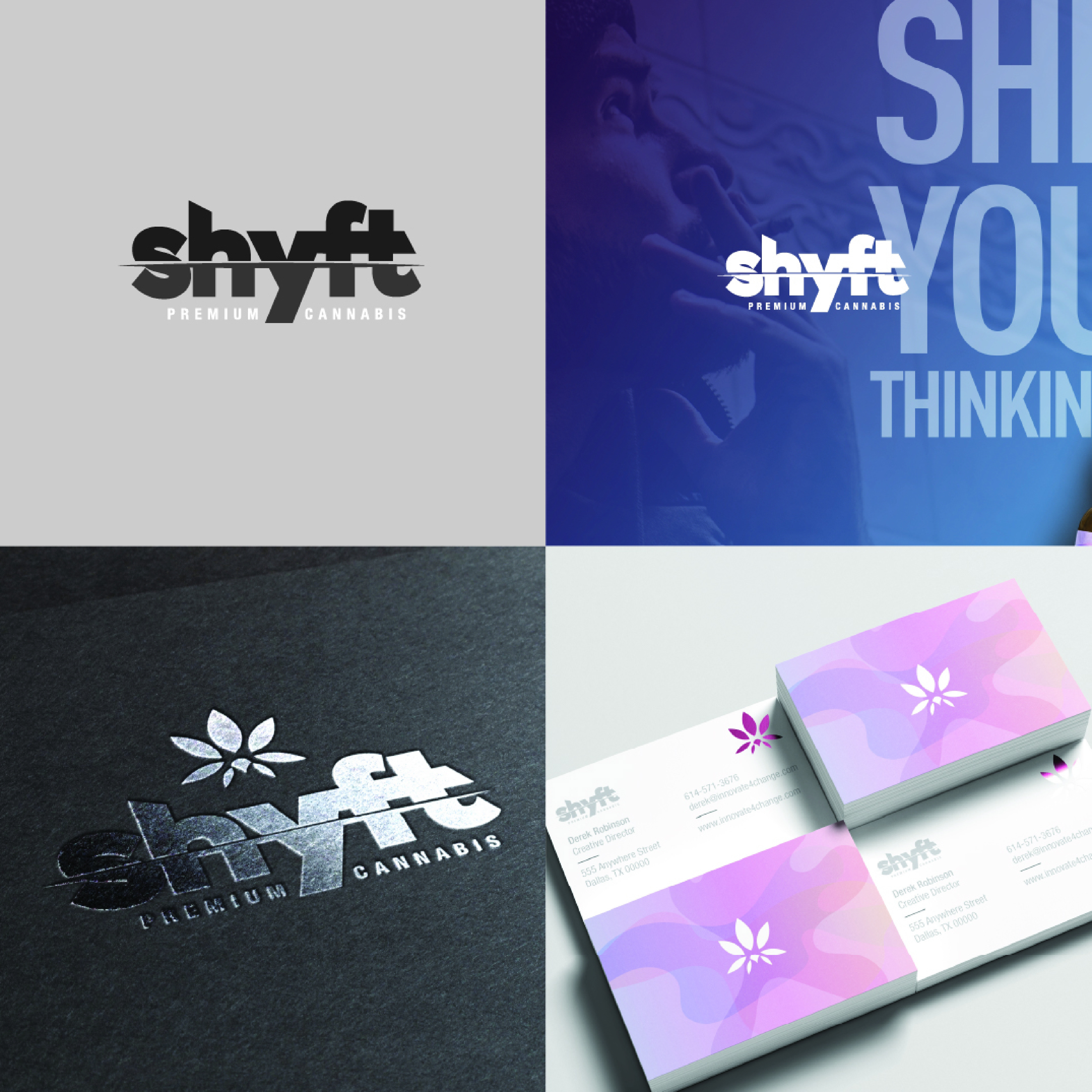
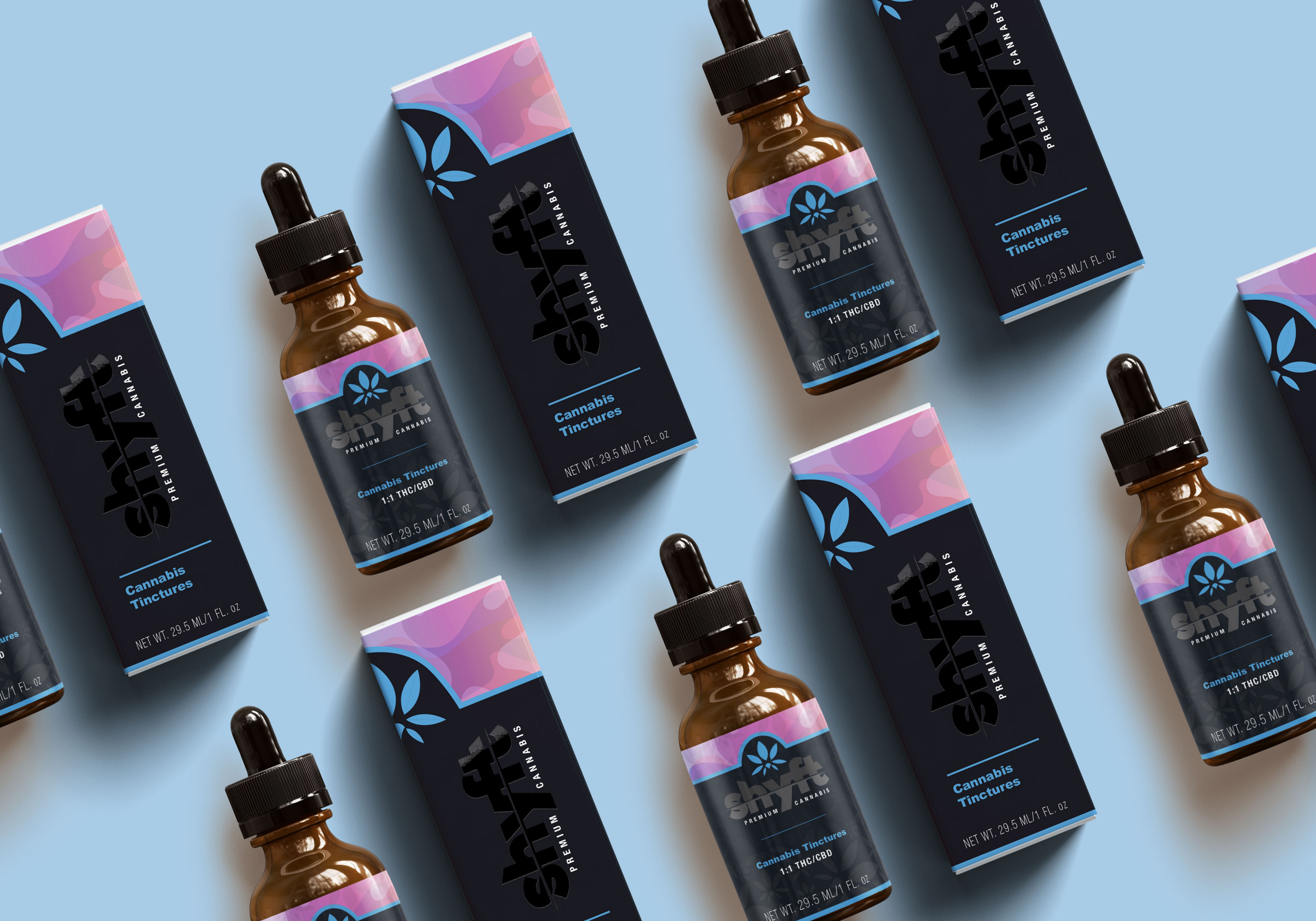
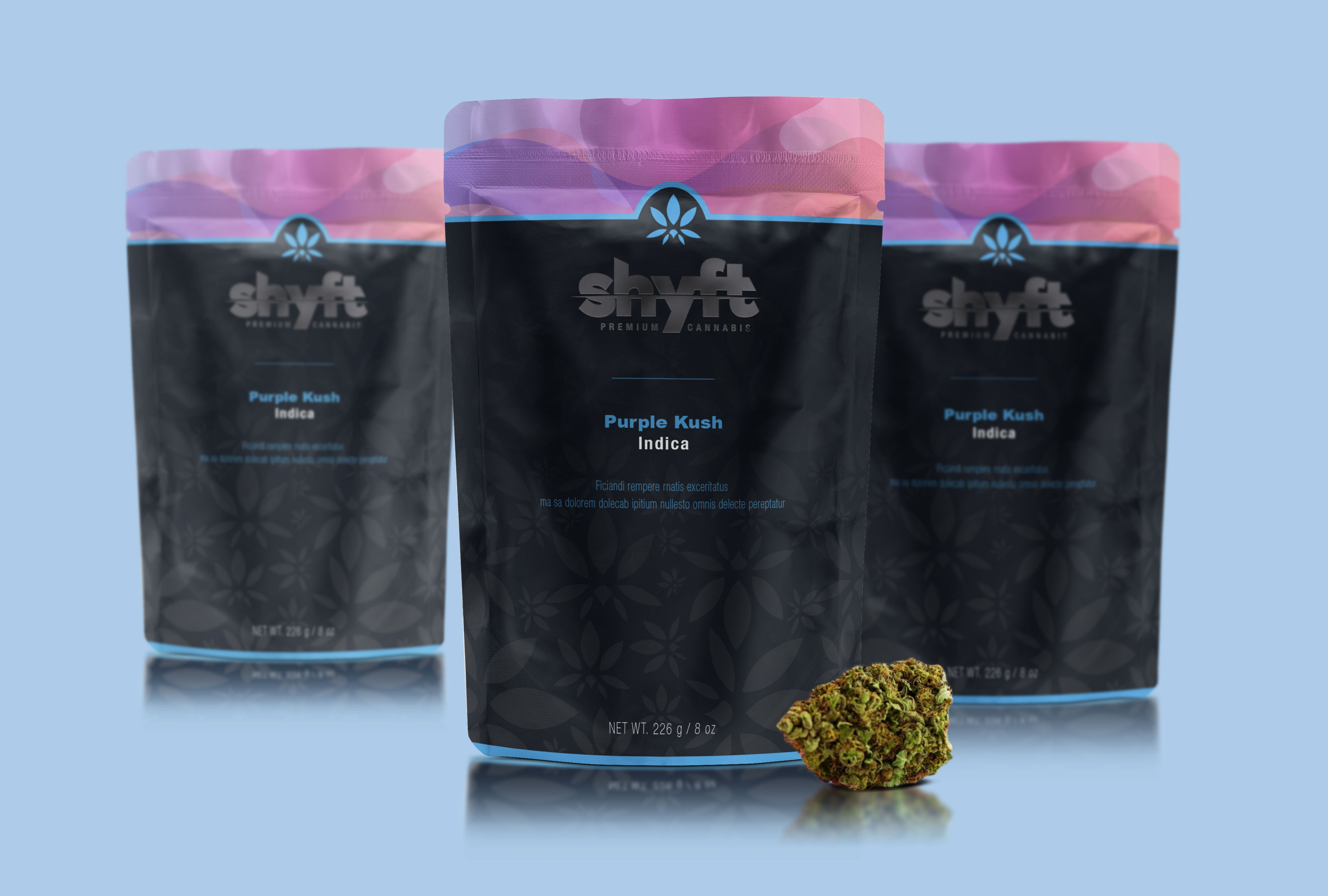
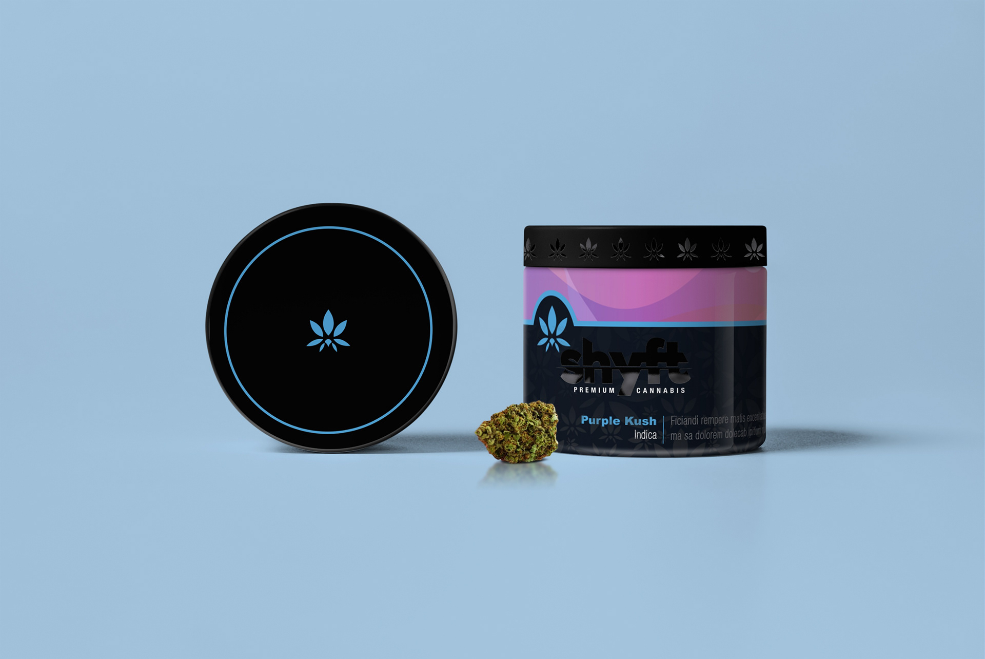
Packaging
The packaging embodied a dash of elegance while still maintaining the urban, youthful feel.